EDITORIAL STUDIO 2023
PROJECT
UNIVERSITY PROJECT
TYPE
EDITORIAL
AUDIENCE
EYE DESIGN SUBSCRIPTORS
PEOPLE WHO WORK IN THE DESIGN INDUSTRY
THE SCOPE
Eye Magazine, a publication on graphic design, typography, and culture, provided students with InDesign files of a 16-page feature. The task was to study its editorial style and condense the layout into 10 pages.
THE SCOPE
Eye Magazine, a publication on graphic design, typography, and culture, provided students with InDesign files of a 16-page feature. The task was to study its editorial style and condense the layout into 10 pages.

THE PROCESS
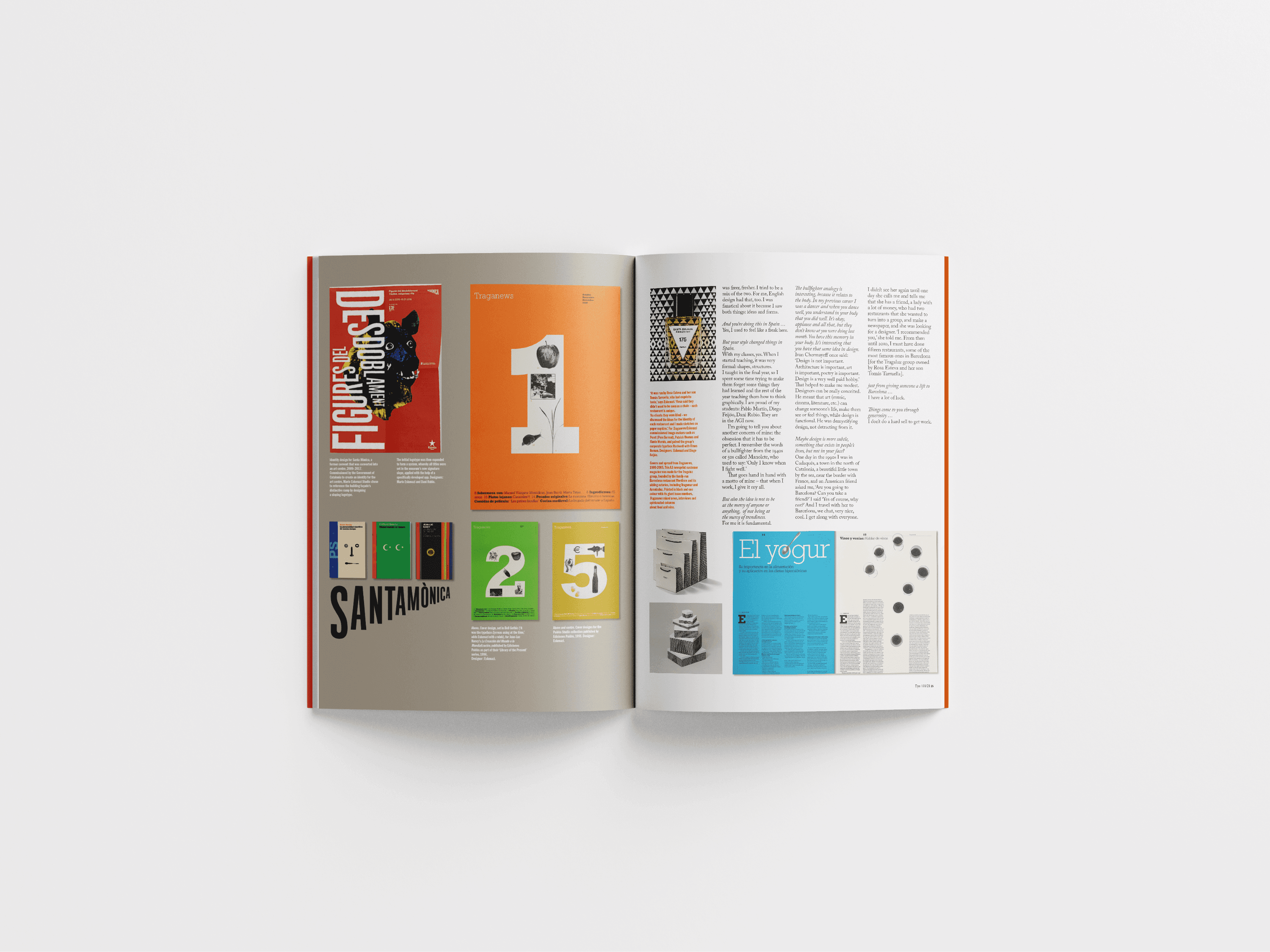
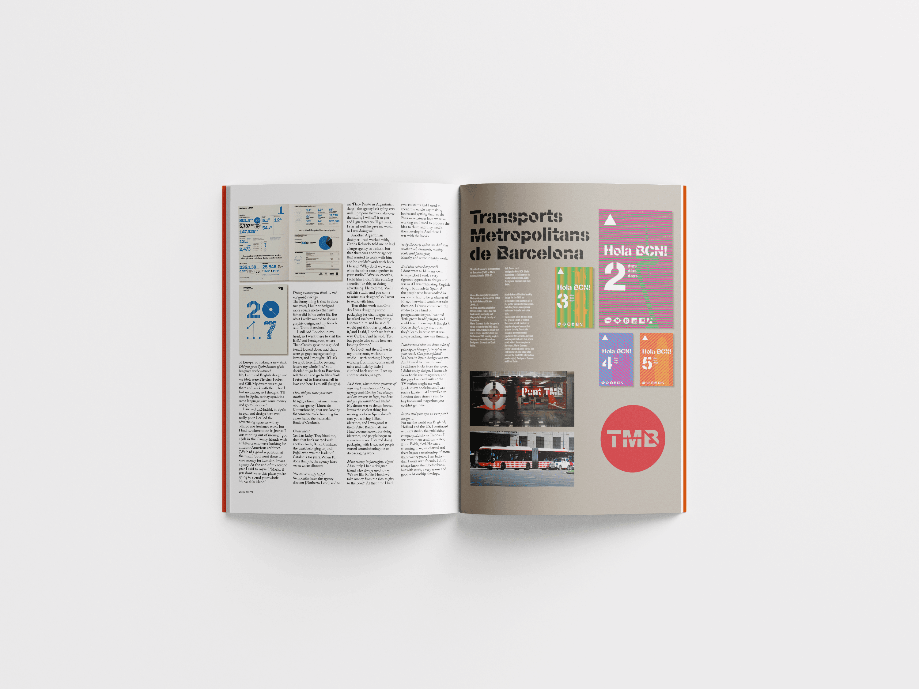
Drawing from Eye Magazine's aesthetic, I contrasted dense text pages with minimal image layouts. To address the struggle of consistent legibility, I arranged text columns in ascending and descending patterns, guiding the reader's eye and reducing visual fatigue. I also incorporated Eye's signature orange for emphasis, using it within a modular grid system for references.


THE DESIGN LANGUAGE
Playful text hierarchy in the columns creates contrast, improving readability and reducing strain.
Inspired by Eye Magazine’s aesthetic, minimalism is applied across spreads, balancing text-heavy columns with imagery and negative space.
Bold typography and vibrant colours add emphasis and engagement for fatigued readers, while the ascending/descending grid suggests movement, hierarchy, and guidance.